The UX Amateur’s Guide to Web Animations
Written by Dan Parry

Written by Dan Parry
High-quality animations are everywhere on today’s web, which is great for us as users, but it doesn’t make life easy for you as a designer. But why should you care? What is it that makes animations so important that you should prioritize them in your, probably already very busy, schedule?
Well, unfortunately, because of the high-quality content we are all so used to in apps and on the web, there is a good chance that users already have a high expectation of what your app should look like and what it should feel like.
High-quality animations and UIs are present in almost every successful app and audiences expect it to be part of their experience; Tinder’s swiping function, browsing through music on Apple music or panning around Google maps are a few examples of some excellent animations that are integrated to the core user experience of their respective apps app.

The core purpose of your app is to achieve a particular goal, the animations you put into it probably won’t change the end result of how your app achieves its goal but it can make or break the user experience. You might not be trying to make the next unicorn but a friendly UX is a must.
So animations are certainly not to be overlooked in the planning stage and you should find time, even in an already overbooked project, to add some. Remember, most users won’t even notice the swipe animation you spent a day perfecting, but they certainly will notice if it’s not there.
What are web animations?
Before we jump into some tips on how to make good animations let’s take a quick look at what an animation actually is. Understanding the fundamentals will help you make better animations in the end.
In short, web animation is the visualization of change — something that starts in one state and ends in another state. The animation is how it gets from one to the other and how you handle states in between (the “interpolated states”) is what is important. The duration you take to get from the start to the end state and the journey you take your users on while doing it is a bit of an art form in itself.
Browsing functions, like turning a page in a digital book or moving through shows on Netflix and the selected show growing to display its details, are both animations. If it changes the state of an element in your UI then it’s very likely an animation.
So we have a pretty good idea about why web animations are important and what they actually are, so let’s take a look at some rules to remember when making your own.
Don’t rush!
The speed of your animation is crucial, it should be slow enough that the user is aware of the change taking place but not take so long that it can be perceived as slow.
Thankfully there are some guidelines on how fast this should be so you don’t just have to eyeball it and hope you get it right — an animation lasting between 200 and 500ms is considered optimal for UI.
Anything faster than this, 100ms for example, will be too fast to notice, equally, anything that takes over a second to complete will be considered slow.

Additionally, the speed of your animations might need to depend on the screen size of the app, because the element will have more or less distance to travel.
For mobile devices, 200–300ms is optimal with a 30% increase and decrease for tablets (400–450ms) and wearables (150–200ms) respectively. Website animations are usually instantaneous, so keep this in mind.
The size of the element is also an important factor in how long it should take to complete its animation — Smaller elements look better when their animations are fast, and larger animations can afford to take a little longer.
It’s an art, not a science, so play around and see what looks best.
Easy does it…
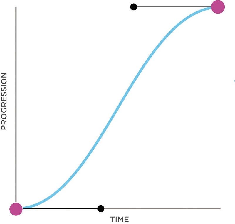
Easing is the acceleration or decoration applied to your object as it begins or ends its animation. It is a very important part of how good your final animation will look.
You don’t want to click on a menu, have it move slowly for 2 whole seconds, then suddenly fly open! It’s jarring to the user and ugly to watch so this is an important topic to learn.
Today let’s just talk about Ease In, Ease Out, and Ease Both. The title refers to how it enters or exits its animation, not the screen, let me explain.
In the context of product design, generally objects that enter the screen decelerate. This is called “Ease Out” because our animation eases out of its acceleration to create a smooth stop, it slows down to a stop over the period of time it takes to come into our frame to its final position.
The opposite is true for an object exiting the screen, it accelerates as it moves away, in this way it is easing into its animation, so it is called “Ease In”. Just remember, ease out when it comes in and ease in when it goes out…

If you want to apply movement to an object that is always on screen, “Ease Both” is the way to go, it applies a smooth speed up and a smooth stop motion to your object as it moves.
To give this a real-world context, let’s use our menu example from earlier, when you click on a burger menu, the menu will open quickly and then stop smoothly (Ease Out) but when you close the menu it will smoothly slide off the screen (Ease In). If you click on an item in the menu and it expands to a pop-up, this will start smoothly and then stop smoothly in the center of the screen (Ease Both).
You should also take a look at Spring or Elastic Easing, if you want to give your animation a really nice motion. The takeaway here is to be aware of the importance of easing, it plays a key role in the animation and will be a big part of your arsenal.
What is this for!?
Maybe you are an expert in animation durations and you can create wonderfully intricate paths for your buttons to fly all over the screen while still creating a clear UI context for your user to interact with. But why? Why add a fly effect and a confetti explosion to a button that just says “OK”?
The animations you add should always serve a purpose, otherwise, you are just wasting your user’s time and eventually their patients. There are for sure some cases in which a cool, flashy animation will be welcome, but as a general rule remember: give the animation a context and a purpose.
Be yourself
Make sure your animations reflect your product’s image. If the website is fun and light-hearted, consider a bouncy and playful animation to the menu with the clever use of your easing curve, this can be subtle but it can add a style that your users will start to consider part of the experience. Alternatively, if you are building an app with a very specific data-driven purpose that users have only a cold, professional interest in, your animations can be a little more spartan.
To sum up…
Animations make your content feel alive, or at least they should if they are done correctly, but it is really up to you how you want to breathe life into it. Consider how you want your users to feel when interacting with it and channel this into your design choices.
There are some great tools to help you design your animations that we at Codesphere love to use. Take a look at Invision studio, Flinto, and of course After Effects, but nowadays there is no end to tools you might use. Feel free to let us know your favorites.
What did we leave out? Let us know down below!
Happy coding from your good friends at Codesphere, the most seamless cloud provider ever created!
