How to set up effective product marketing dashboards
Diving deeper into your user data can seem like a daunting task but once you get into it there few things as captivating!
In the last few weeks we have been really diving head deep into our analytics and I thought this would be an amazing opportunity to share what we build on top of our serverside custom user-activity tracking. Interested in how serverside tracking works in general? Check out this recent article.
Now even the best data collection isn't worth much if you cannot deduct actionable insights from it.
For me it's always easiest to start a dashboard with a clear (company/team) objective in mind - chances are if you are reading this you have something in mind. For us we are currently focusing our effort on two things:
- Optimize top of funnel - Nurture as many of our page visitors to sign-up to Codesphere
- Understand onboarding / usage funnel - Learn how to support users to successfully run their first application on Codesphere
Zero config cloud made for developers
From GitHub to deployment in under 5 seconds.
Review Faster by spawning fast Preview Environments for every Pull Request.
AB Test anything from individual components to entire user experiences.
Scale globally as easy as you would with serverless but without all the limitations.
Also depending on your ability to modify things in the funnel and capacity in the team you will either be in a data driven "optimization phase" or in more of an "exploration phase" - in my opinion exploring first is really important, also it typically takes less team capacity than building (& testing) optimizations.
Each of these phases has unique challenges, so you are looking for different types of actionable insights and ultimately your dashboards will look different.
Top of funnel (optimization phase)
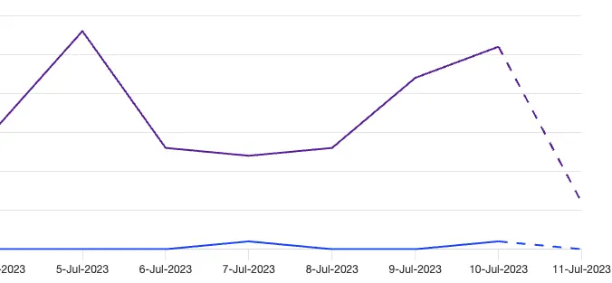
Key here is that we maintain a steady or ideally growing pace of sign-ups to our tool. The first two visuals in our board are therefore dedicated time series charts, one for the pageviews and one for the number of sign-ups per day. The number of pageviews directly correlates with our ad spend and remains mostly constant if we do not change anything there - sometimes unexpected surges happen though (i.e. after press coverage) and they will bump all other visuals along so I like keeping an eye on it.
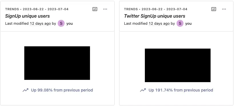
Up next I always put the absolute / unique user values that we are currently trying to optimize alongside how it changed to the previous period (usually last 14 days vs. last 14 days before that). Again always checking what actionable insights this might provide: These tell me the overall health of what we are trying to achieve, also it's great to challenge the team to try and hit weekly goals based on these.
A/B testing improvements
After looking at time trends and absolute numbers we now want to check out the funnel conversions. We have an in-depth article on how funnels work, what you need to pay attention to and what limitations are so we will be brief here.
The funnel steps we are tracking for our current a/b test (8 different landing page versions) are PageView (any landing page version) → SignUp Form → SignUpAttempt (starting oAuth flow or submitting form with email) → EmailConfirmed → Usage (Any).
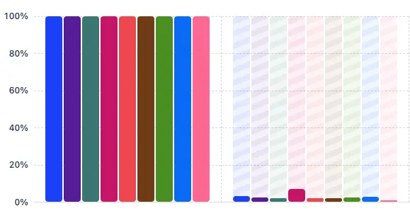
We set the order to sequential, attribution for our version flag to initial (because our test differs in the first funnel step) and added a breakdown by our version flag. Posthog then shows us the conversions per step, and even highlights where conversions are significantly above or below the baseline.
Exploration phase
As you can see, for the top of the funnel, we are currently actively running optimizations and analyzing accurately how these develop over time and continuously testing improvements.
For later funnel steps we are currently preparing to move into that mode of testing improvements - before we can do that though we need to get a better understanding of how people navigate through the tool, what features are discoverable and also get a feeling where to start optimizing.
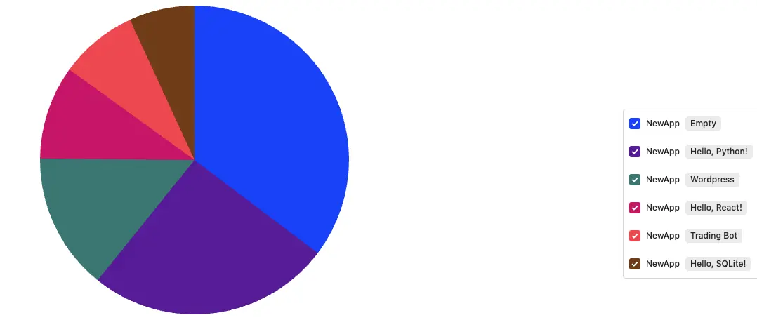
We again have absolute values for the key metrics here (i.e. number of new Apps, number of new paid apps, number of successful deployments etc.). From there though we break down more qualitatively which feature is used how often, or which templates are used. We care less about time trends and more about understanding overall usage patterns. On top of looking at user-activity events we will also spend some time watching session recordings and conducting explorative interviews.
Diving deeper into your user data can seem like a daunting task but once you get into it there few things as captivating and addictive as watching how your work transforms patterns. I hope this article has given some useful inspiration to get you started!
